Start with color
Replace the default palette with your brand colors. Update tokens for primary, secondary, and neutral tones, then test them across components to ensure contrast and readability remain strong.
Adjust typography
Swap in your chosen fonts and set type scales that match your brand’s voice. Keep the structure of headings, body text, and captions so content remains legible and consistent.
Refine spacing and layout
Review the spacing tokens to match the rhythm of your brand. A tighter or looser grid can shift the feel of the interface without breaking consistency across components.
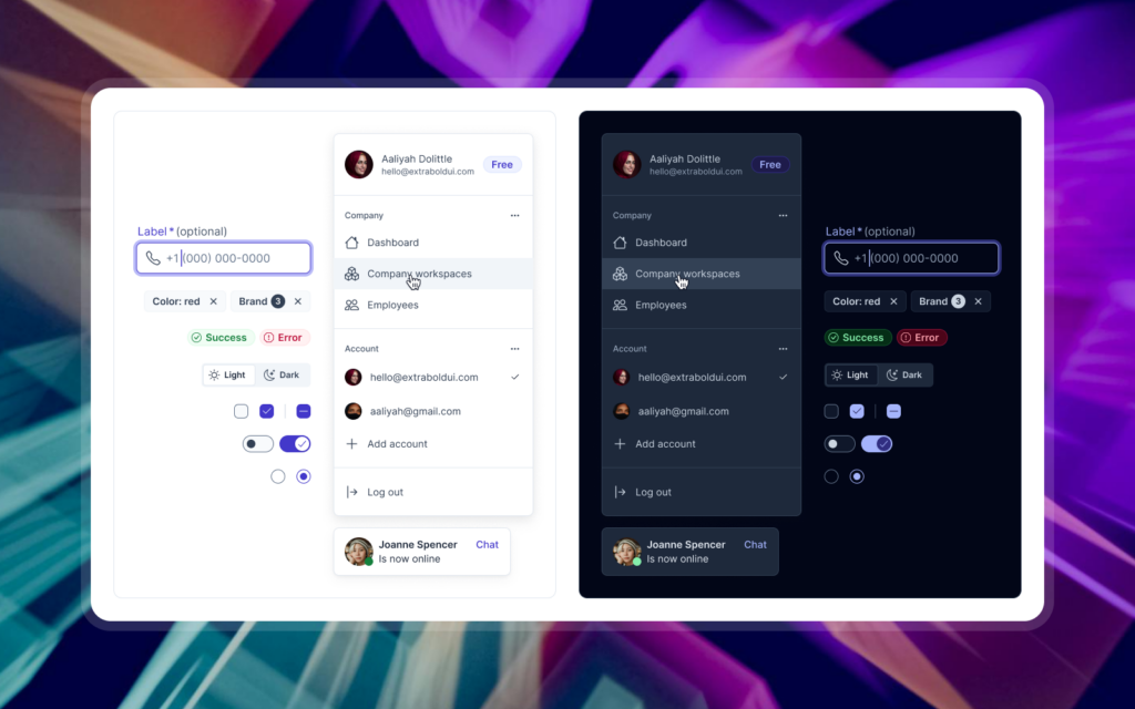
Update components
Buttons, forms, and cards should feel familiar to your users but distinct to your product. Apply your updated tokens to components, adjust corner radii, shadows, or borders, and check how these changes scale across variants.
Add brand-specific patterns
Beyond components, consider patterns that represent your product’s workflows. Document navigation styles, onboarding sequences, or dashboards that your team will reuse often.
Keep documentation current
As you adapt the kit, record the changes. Document which tokens were replaced, how typography was adjusted, and any new patterns you introduced. This record ensures your team stays aligned and future updates are easy to apply.
Customizing a design system kit is about balance. You keep the structure that speeds up collaboration while shaping it to express your own identity. The outcome is a product that feels unique but still benefits from a reliable foundation.